If you want visitors to not only land on your website but also make purchases and return in the future, you must blend attractive design with an intuitive interface. This concept is often referred to by the technical term “usability.” When a website possesses strong usability, visitors can quickly and effortlessly find what they need, understand their next steps, and achieve their goals.
In this article, we will break down the concept of usability in simple terms, explain why it directly impacts conversion rates, and show you how to build a website that serves both the user and your business objectives.

What is Usability in Simple Terms
Usability answers one fundamental question: how comfortable is it for a person to interact with a website? We are not talking about designers or marketers here, but the everyday visitor who arrives to read, buy, or learn something.
Excellent usability means that a user will:
- Instantly understand where they have landed;
- Easily locate the desired section;
- Quickly complete a purchase or submit an inquiry;
- Avoid confusion, frustration, and ultimately, bouncing to a competitor’s site.
Usability is frequently confused with visual design, but they are distinct concepts. A graphic might be stylish and vibrant, yet entirely superfluous.
Designers sometimes fall into the trap of adding excessive creativity just for the sake of it. They might implement complex animations or select rare, hard-to-read fonts. However, the visitor came for a specific service and ends up lost in unnecessary flourishes and confusing transitions. This is exactly when usability must take precedence over pure aesthetics.
Example of a minimalist website design
A convenient website isn’t necessarily the one that looks the most beautiful. It is the one where you don’t have to guess where to click. Everything should feel logical, familiar, and predictable.
And yes, this has a direct impact on your revenue. Usability doesn’t just serve aesthetics; it drives conversions, sales, customer retention, and lifetime value.
Why Usability Matters for Websites, Landing Pages, and Interfaces
When people say a website should be user-friendly, they often forget to specify for whom. Audiences vary, as does their level of digital literacy. However, there is one universal rule: if a person cannot figure out what to do next within 5 to 7 seconds, you will lose them.
Strong usability positively impacts key performance indicators:
- Conversion Rate (CR): A streamlined path to the action button generates more inquiries.
- Page Depth: When everything is clear, visitors are more likely to explore additional pages.
- Return Visits: Memorability and a positive experience encourage customers to come back.
On one of our recent projects (a landing page for online consultations), we reduced the steps required to place an order from four clicks to two, removed an intrusive pop-up, and added helpful hints to the form fields. As a result, the conversion rate increased by 22%—with the exact same traffic volume.
The opposite scenario is equally telling: a user arrives, sees a site cluttered with banners, cannot find the necessary information, and doesn’t understand how to get the help or service promised in the headline. They leave. And often, they never return.
Example of a website cluttered with ads rather than content
It is also worth noting the difference between web usability and app usability. On the web, users tend to behave more superficially—they arrive from search engines or ads and evaluate the site rapidly. In an app, they are usually already familiar with the product and willing to invest more time. However, the core principles remain the same: minimize frustration and maximize clarity.
Core Principles of Excellent Usability
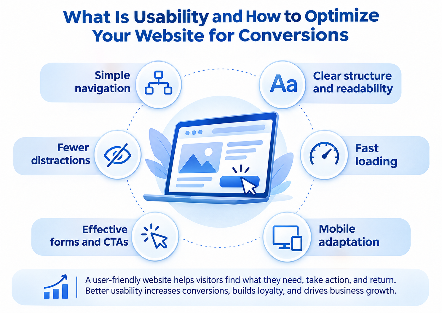
Implementing usability doesn’t require magic; it requires common sense. Anything that hinders a person from quickly solving their problem on a website is an issue. Anything that facilitates this is good UX. Below are six foundational principles for building a user-friendly site.
Intuitive Navigation and Logical Block Structure
Users shouldn’t have to play detective. Menus, links, page structures, and company information should be exactly where people expect to find them. There is no need to reinvent the wheel: if users are accustomed to seeing the shopping cart in the top right corner, do not hide it in the footer just to be “unique.”
With proper navigation, users move through the site intuitively, without puzzles or guesswork.
The shopping cart is traditionally placed in the top right corner of online stores
Readability, Visual Hierarchy, and Grid Systems
Tiny text, clashing color palettes, and chaotic layouts all hinder comprehension. Good design should guide the eye:
- From the main heading to the subheading;
- From the content block to the action button.
Maintaining a clear hierarchy through headings, spacing, and visual accents is crucial. Visual order helps the brain grasp the core message and make decisions faster.
Example of navigation in a gift shop
Rapid Page Loading
No amount of beautiful design can save a website that loads slowly. Load time directly impacts bounce rates, especially on mobile devices. Every additional second of delay can cost you 10% to 20% of your visitors.
Minimize scripts, optimize images, and avoid excessive animations. True convenience includes speed.
Mobile Device Adaptation
According to Statista data from 2024, over 62% of users access the internet via smartphones. If your site is not mobile-responsive, it essentially does not exist for the majority of your audience.
Global mobile website traffic from Q1 2015 to Q4 2024
Check if all essential elements are visible on the main screen without zooming. Are buttons easy to tap? Do forms extend beyond the screen edges?
User-Friendly Forms and Calls to Action (CTAs)
Forms should be straightforward. Do not ask for information that isn’t immediately necessary. Make your buttons prominent and specific: instead of “Submit,” use “Get a Free Consultation”; instead of “More Info,” use “Download the Guide.”
A call to action should compel action, not provoke the question: “What exactly happens if I click this?”
Minimizing Distractions
Flashing banners, auto-playing videos, and pop-ups that appear two seconds after arrival all irritate visitors and decrease engagement. People come to find a solution, not to fight off advertisements.
In marketing, the simpler the path to the goal, the higher the probability that users will complete it.
The consultant chat should appear only after the visitor has scrolled to the bottom of the page, not before
Methods for Evaluating and Analyzing Usability
To improve usability, you must know how to measure it. Here are five proven methods that will genuinely help you identify where your site is underperforming.
Analyzing User Behavior
Click maps, heatmaps, and scroll maps reveal exactly where people look, what they click, and where they hesitate. This is an excellent way to discover, for instance, that a crucial button is being ignored while a header banner distracts from the main goal.
Utilize tools like Hotjar, Yandex Metrica, or Microsoft Clarity for this analysis.
Example of a heatmap in Microsoft Clarity
Behavioral Metrics
Review these indicators in Google Analytics: bounce rates, time on page, and pages per session. A high bounce rate is a strong signal that your usability needs improvement.
Setting up a data stream from a website in Google Analytics
Keep in mind that a poor metric is not a final verdict, but a prompt for investigation. The issue might stem from the content, site clutter, or simply the user’s confusion about where to click.
Manual Usability Audit
In this method, an expert sits down and walks through the user journey step-by-step: from landing on the site to completing the target action. They view the site through the eyes of a visitor, not the owner. Often, this is enough to spot obvious flaws: a hidden cart, illogical blocks, or duplicate buttons.
You can perform this audit yourself—simply try to complete a purchase as if you were visiting the site for the very first time.
Surveys, Feedback, and Focus Groups
Sometimes, the best approach is to ask people directly. This is especially true if the site has been running for a while but the conversion funnel is stagnating. A brief survey asking, “What was unclear?” or “What would you like to see improved?” can yield a wealth of insights.
Focus groups are also an ideal marketing tool for redesigns. Simply show a mockup to 5–7 people and observe their actions, where their eyes go, and where they get lost.
Insights from the Nielsen Norman Group (NNGroup)
If you want to dive deeper, study the research of Jakob Nielsen, the founder of NNGroup. This is the gold standard in usability. They offer detailed case studies, guides, and checklists. For example, explore the “three-click rule,” the concept of cognitive load, and read about the dozens of mistakes that even major corporations repeatedly make.
Examples of free research available on the NNGroup website
What Website and Interface Usability Encompasses
When we discuss website usability, we are not just talking about load speed. It is equally important how easily, quickly, and clearly a person can achieve their goal: finding a product, ordering a service, or reading an article. Below are the key components of this convenience.
Visual Interface (UI)
This includes everything the user sees: colors, typography, buttons, icons, and spacing. In short, everything that influences perception. A good UI should not distract or raise questions. It succeeds when the user doesn’t even think about how to use it.
For instance, if a “Buy” button doesn’t look clickable, that is an interface flaw, even if the underlying code functions perfectly.
Structure and Logic (UX)
UX represents the logic of interaction: how a person navigates from the homepage to the order form, what steps they take, and where they make decisions. In marketing, this is often referred to as site architecture.
Clear scenarios are vital here: “Arrived → Found → Understood → Clicked → Received.” If any link in this chain breaks, conversions will drop.
Example of a compelling call-to-action button on a product card
Interaction Scenarios
Usability depends not only on the interface but also on how the customer journey logic functions. For example, what happens after a button is pressed? Does a confirmation appear? Can the user go back? Are different search scenarios accounted for?
A well-designed interface anticipates user actions and minimizes the chance of errors.
Error Messages, Hints, and Microcopy
If a user makes a mistake, the site should explain how to fix it, not scold them. Instead of a generic “Error,” write: “Please enter your phone number in the +7 format.” Instead of “Unavailable,” use: “This service is currently not available in your region.”
The same applies to microcopy—short textual hints in forms, labels, and messages. Often, it is these small details that create a user’s sense of convenience and care.
Example of customer care when a website subsection is temporarily unavailable
How to Conduct Usability Testing
If you suspect there are problems but cannot pinpoint them yourself, it is time to bring in actual users. In theory, everything might look perfect, but in practice, you will immediately see how a real person interacts with the site, where they stumble, and what confuses them. Here is how to run such tests.
Preparation: Goals, Hypotheses, and Tasks
First, define why you are doing this. Do you want to understand why users aren’t filling out the form? Or why they aren’t clicking the main button? A clear goal will help you formulate specific scenarios: “Find a product,” “Complete an order,” or “Submit an inquiry.”
Important! Do not try to test everything at once. It is better to focus deeply on 1 or 2 hypotheses.
Participants, Scenarios, and Moderator
Five to seven participants are usually sufficient. The key is that they must represent your target audience, not your colleagues or friends.
The scenario should feel natural: “Imagine you want to purchase…” Do not give hints or guide them. Simply observe.
You will need a moderator. Their role is to present the scenario and record behavior: where users look, where they hesitate, and what questions they ask.
Estimated pricing for audits and focus group testing
Execution and Observation Recording
Observation can be done in person or via a screen-sharing tool like Zoom with recording enabled. The most important rule is not to interrupt the participant. Let them act naturally. Sometimes, silence reveals more than a hundred words.
Document where the tester:
- Cannot find what they need;
- Performs an unintended action;
- Asks, “Where is the…?”
These are your exact points for improvement.
Analyzing Results and Implementing Improvements
After the tests, sit down and list all your observations. Highlight recurring issues: if three out of five people missed the button, it is not a coincidence; it is a design flaw.
Next, prioritize: what is critical to fix now, and what can wait. The most important step is to avoid shelving the report and actually implement the changes.
Common Mistakes That Hinder Website Convenience
Even the most visually stunning website can repel visitors if it is difficult to navigate. Below are typical usability errors that cause conversion rates to plummet and customers to leave.
Overly Complex Navigation
If a visitor cannot figure out where to click or how to reach a specific section, it is not their fault; it is a navigation failure. Excessive menu items, deeply nested submenus, and vague labels (“Solutions,” “Products,” “Features” instead of straightforward “Pricing,” “Reviews,” “Contact”) will drastically reduce effectiveness.
Example of overly complicated section names
Hidden Critical Elements
If the order form is only visible after the third scroll, and the phone number is buried in the footer, you are losing leads. Crucial information must be prominent, ideally on the first screen. Users should not have to play a scavenger hunt to find the “Buy” button.
Tiny Fonts and Cluttered Blocks
Visitors will not read your text with a magnifying glass. If they have to squint, they will simply leave. The same applies to cluttered blocks: too much content, advertising, buttons, and highlighting will scatter their attention.
Unclear Actions
Sometimes a button looks like plain text, or a necessary action is hidden behind an ambiguous icon. For example, a shopping cart without a label, or a filter that only activates when clicking a barely visible symbol. This causes confusion and high bounce rates.
Example of poorly placed call-to-action button
Lack of Touch Adaptation
On mobile devices, it is frustrating to tap tiny elements, scroll through horizontal tables, or pinch-to-zoom just to read text. If you do not optimize for mobile convenience, you will lose a massive portion of your traffic.
How to Improve Website Usability: A Checklist
If you want to enhance your resource’s convenience, start with these simple steps. Here is a practical checklist to help you quickly identify and resolve weak points across all critical criteria.
Simplify the Path to the Goal
The fewer steps required to take action, the higher the likelihood that the user will complete it. Do not force visitors to click through five pages to make a purchase. Minimize the number of clicks required to reach the form, cart, or key section.
Make the Interface Understandable at First Glance
According to marketing principles, the first screen must answer three questions:
- Where am I?
- What is being offered?
- What can I do here?
If these answers are not obvious, you have a usability problem. Check how easily a new user can navigate the interface without any instructions.
Add a Search Bar and Filters
Search is a lifesaver for users who do not want to browse through categories. Filters allow them to quickly find a specific product, service, or article. The key is to make them visually distinct and fast-loading.
Audit Your CTA Buttons
Calls to action are the engines of conversion. They must be:
- Visible: Experiment with contrast and size;
- Clear: Replace “Learn More” with “Download the Checklist”;
- Logically Placed: Position them near descriptions, forms, or pricing.
If your CTA buttons blend into the background or fail to inspire a click, they need to be redesigned.
Example of poorly positioned CTA button
Conclusion
The concept of “usability” is far removed from mere aesthetics and decorations. It is the foundation of the interaction between a website and a human being on the internet. If an interface is clear, logical, and non-irritating, the user is far more likely to complete the target action: placing an order, submitting an inquiry, and returning multiple times.
Working on usability is not a one-time task. User behavior and habits evolve. Therefore, even an excellent website requires regular checking, testing, and refinement. View usability audits as an investment that directly impacts your business outcomes.
Excellent usability:
- Saves money;
- Builds trust;
- Makes your resource highly competitive.
If you are unsure about your site’s convenience, test it. If you are confident, test it anyway. Often, minor oversights cost far more than they appear to.
FAQ
Are usability and UX the same thing? Not exactly. Usability is a component of UX. It focuses on convenience, simplicity, and interaction efficiency. UX (User Experience) is broader, encompassing emotional perception, scenario logic, and the overall impression of the product. You can think of good usability as the foundation for high-quality UX.
Is usability testing necessary for a single-page website? Yes, especially for a sales landing page. Even a simple landing page can have a confusing path to the button or an unclear offer. Conducting usability tests (or at least reviewing session recordings in Hotjar or Yandex Metrica) frequently reveals basic issues: users missing the button, not knowing what to do after scrolling, or being unable to find the price.
How often should a usability audit be conducted? Ideally, every six months or during significant changes: a redesign, the launch of new services, or a surge in traffic. You should also initiate an audit if behavioral metrics decline: rising bounce rates, decreasing page depth, or increasing load times. Treat usability audits not as a formality, but as a practical tool for website improvement.
How much does a usability audit cost? The price depends on the depth of analysis and the provider. A basic express evaluation from a freelancer might start around $50. A comprehensive audit, including behavioral analysis, focus groups, a detailed report, and actionable recommendations, typically starts at $500 and goes up. In any case, it is an investment in convenience, which directly translates to website performance.